Bauhaus Museum Competition
Insight
[:en]
FROM KANDINSKY TO MIES
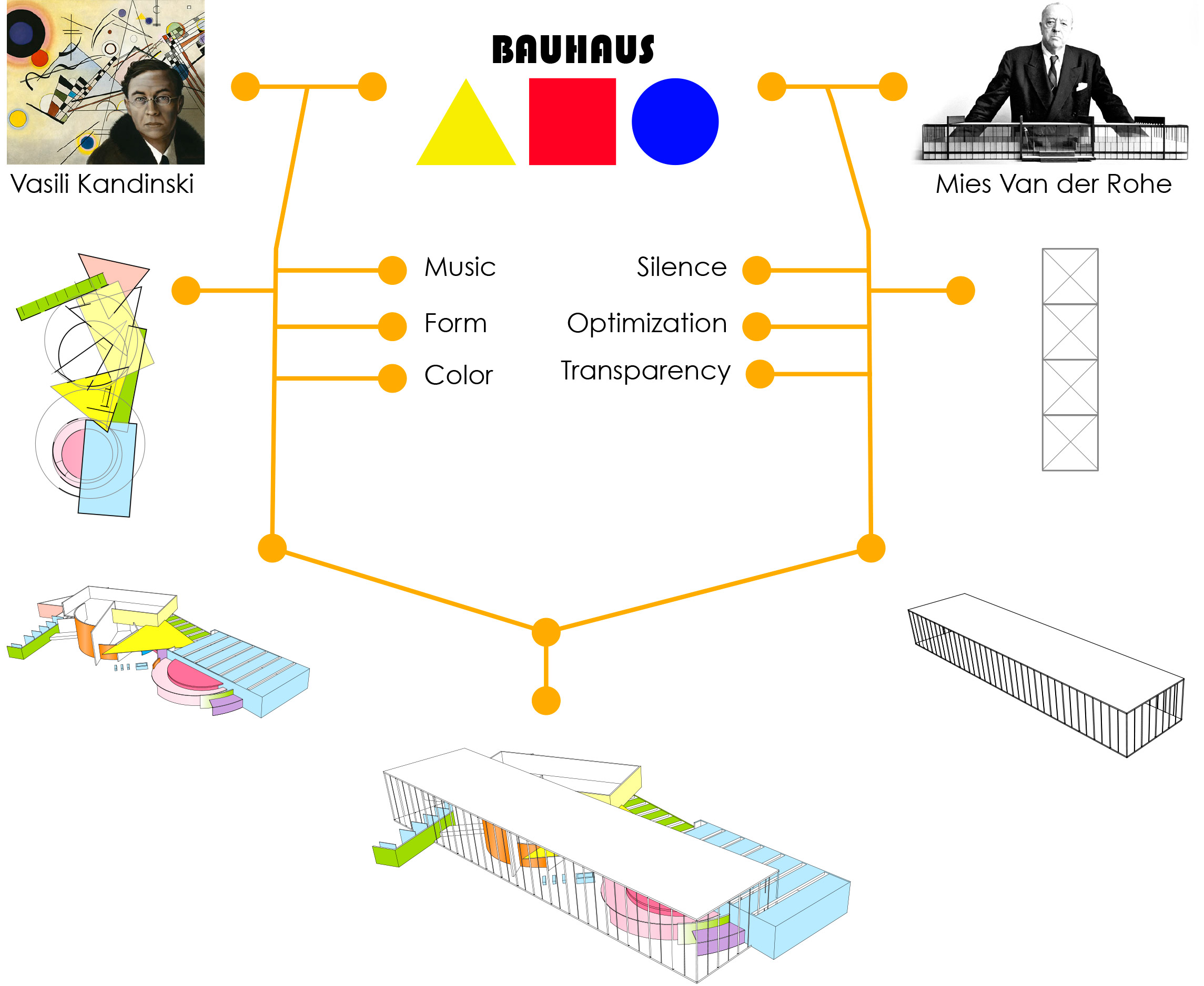
Bauhaus is the artistic experimentation field that runs from Kandinsky´s compositional theory to Mies Van Der Rohe´s glass box.Kandinsky created a formal and unique language based on music, color and shapes while Mies Ven der Rohe experimented with transparency, silence and geometric purity. The transition from Kandinsky to Mies is called Bauhaus.
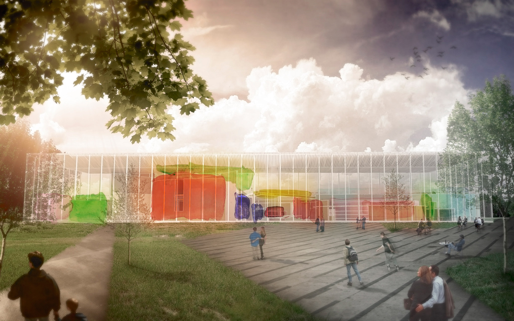
The Bauhaus Museum proposal is a friction between these two research worlds. On one side, we have created a glass box; it´s oriented to the park in order to transmit calm and serenity. On the other side, we have merged Bauhaus colorful language with the city activity.
Our purpose was to create a unique space easily identified with the Bauhaus most iconic expression where people can feel their history through the building’s internal rhythm.
[:es]FROM KANDINSKY TO MIES
Bauhaus is the artistic experimentation field that runs from Kandinsky´s compositional theory to Mies Van Der Rohe´s glass box.Kandinsky created a formal and unique language based on music, color and shapes while Mies Ven der Rohe experimented with transparency, silence and geometric purity. The transition from Kandinsky to Mies is called Bauhaus.
The Bauhaus Museum proposal is a friction between these two research worlds. On one side, we have created a glass box; it´s oriented to the park in order to transmit calm and serenity. On the other side, we have merged Bauhaus colorful language with the city activity.
Our purpose was to create a unique space easily identified with the Bauhaus most iconic expression where people can feel their history through the building’s internal rhythm.[:]
Idea
[:en]
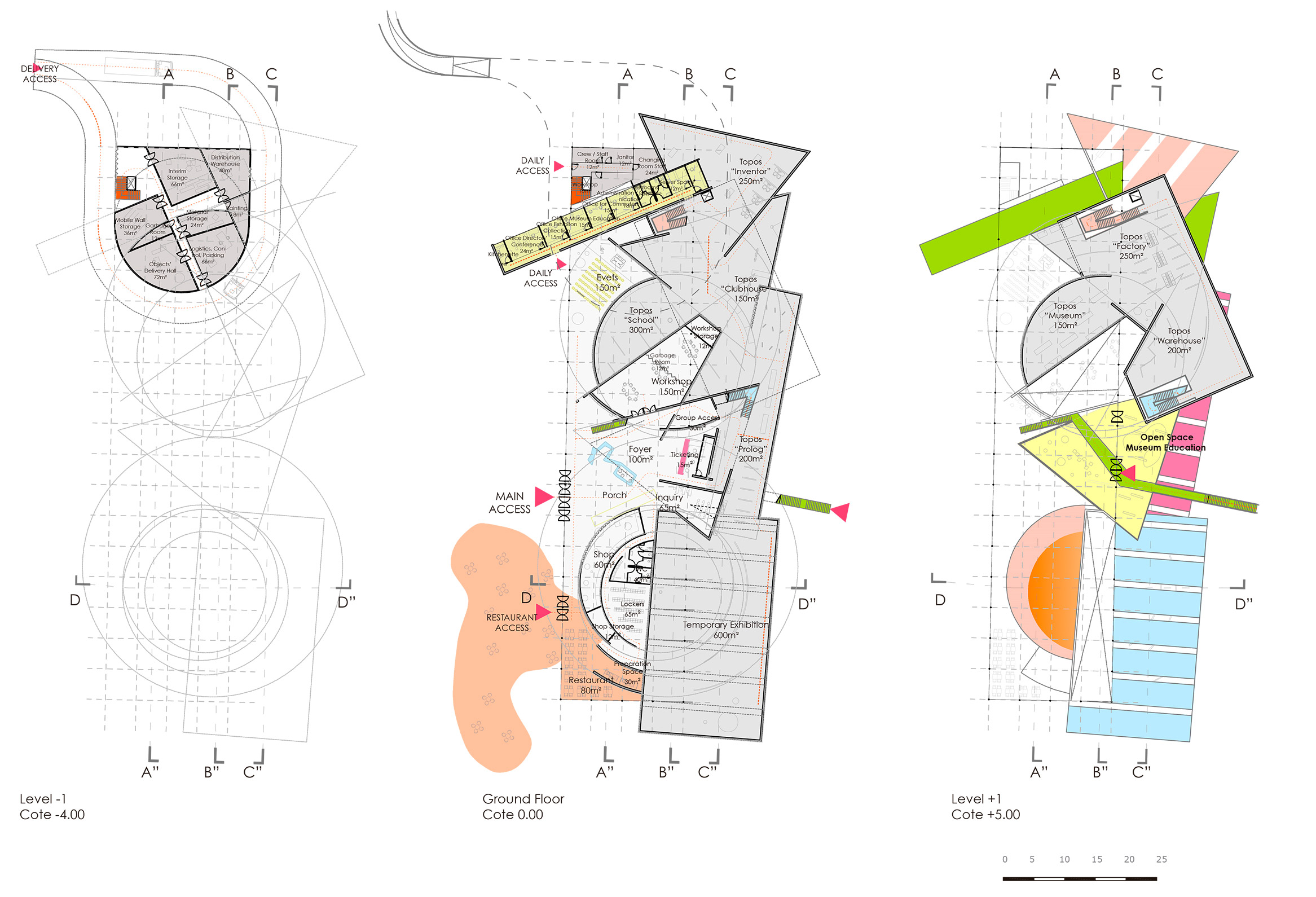
In urban terms the building it is a reinforcement of the site’s two main identities: the park and the city. While the park behaves as an observer-passive environment, the city becomes a purposeful-active one.
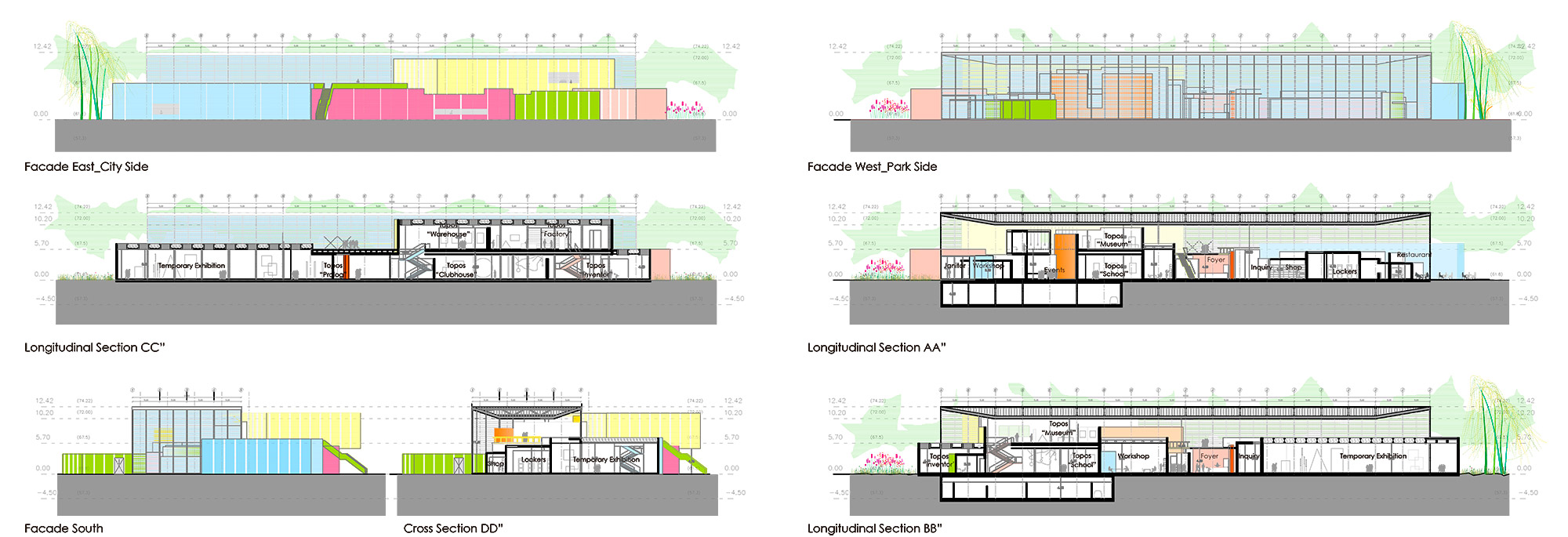
The park spots the interior of the building through a horizontal and transparent line of facade while the city shocks with broken, colorful and energetic volumes.
As a prolongation of Ratsgass pedestrian Street, a promenade axis goes across the museum to create a direct connection from the city to the park through the building. An urban terrace (it) is placed at this axis, a place to see the city from above and create a transition space between the building and it`s context.
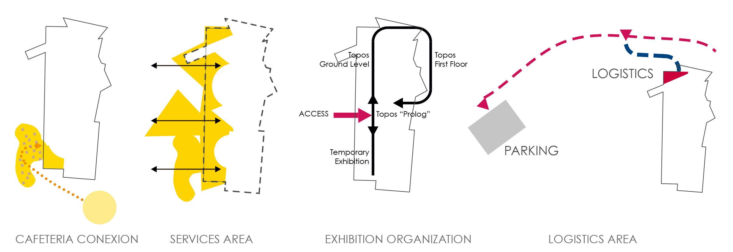
The building (it) is an answer to the conext main axes. As nowadays the highest bustling area and main acces to the park it is the fountain plaza in Kavalierstraße, the cafeteria finds here its perfect location.
In order not to interfere with the parks activity, Logistics area it is placed on the northern side of the building, in direct connection to the parking and Friedrichstraße trafic access.
[:es]
In urban terms the building it is a reinforcement of the site’s two main identities: the park and the city. While the park behaves as an observer-passive environment, the city becomes a purposeful-active one.
The park spots the interior of the building through a horizontal and transparent line of facade while the city shocks with broken, colorful and energetic volumes.
As a prolongation of Ratsgass pedestrian Street, a promenade axis goes across the museum to create a direct connection from the city to the park through the building. An urban terrace (it) is placed at this axis, a place to see the city from above and create a transition space between the building and it`s context.
The building (it) is an answer to the conext main axes. As nowadays the highest bustling area and main acces to the park it is the fountain plaza in Kavalierstraße, the cafeteria finds here its perfect location.
In order not to interfere with the parks activity, Logistics area it is placed on the northern side of the building, in direct connection to the parking and Friedrichstraße trafic access.[:]
[:en]
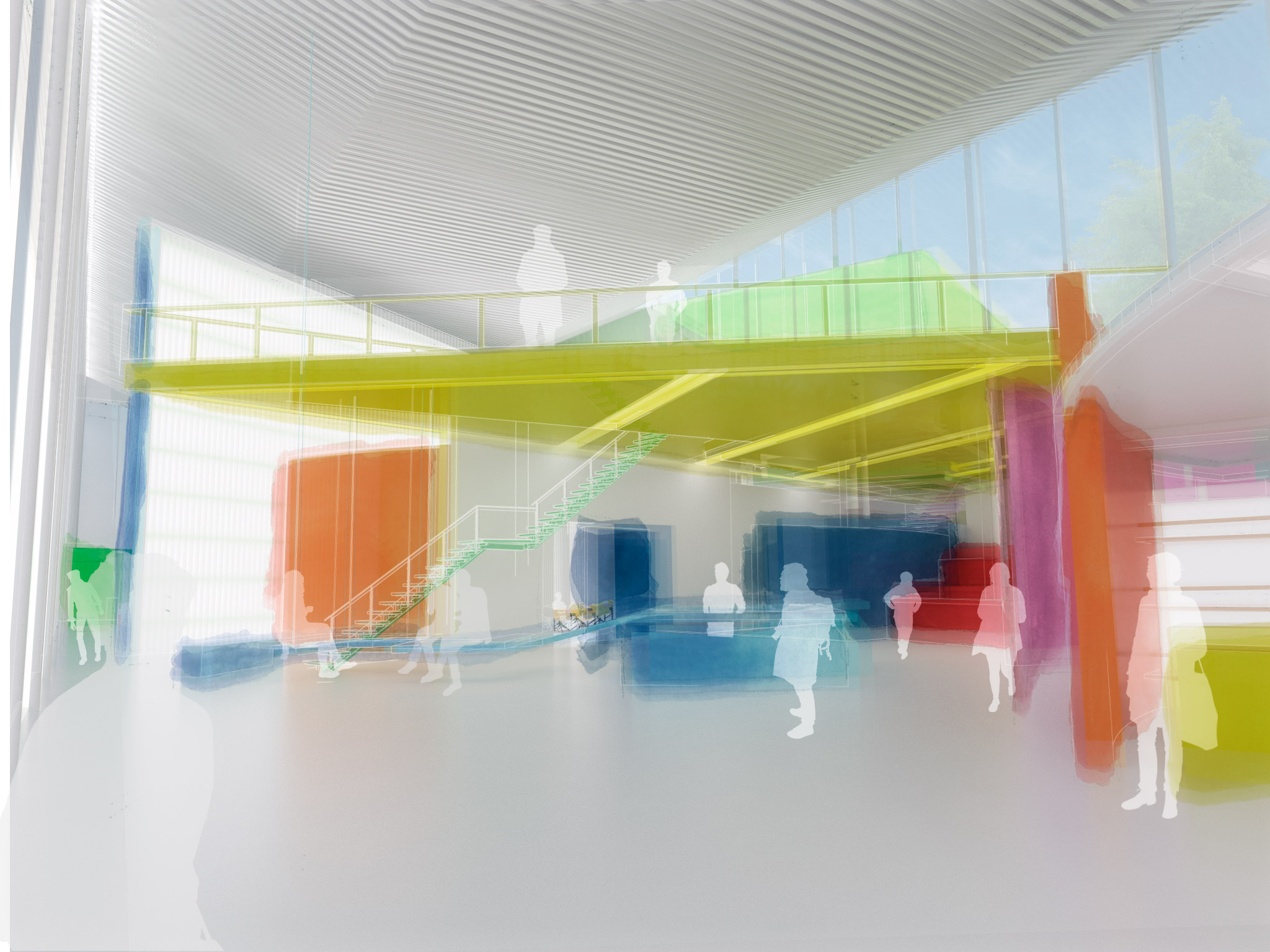
Interior space it is architectural proposal central theme. Bauhaus was also a consequence of Adolf Loos research about planning architectural space from inside to outside. This project has been created as an internal landscape contained into a glass box, a Bauhaus city under a great roof. This roof it is a huge building lamp. Great 20 meters long and 2 meters high beams cover the building liberating interior space from structural elements.
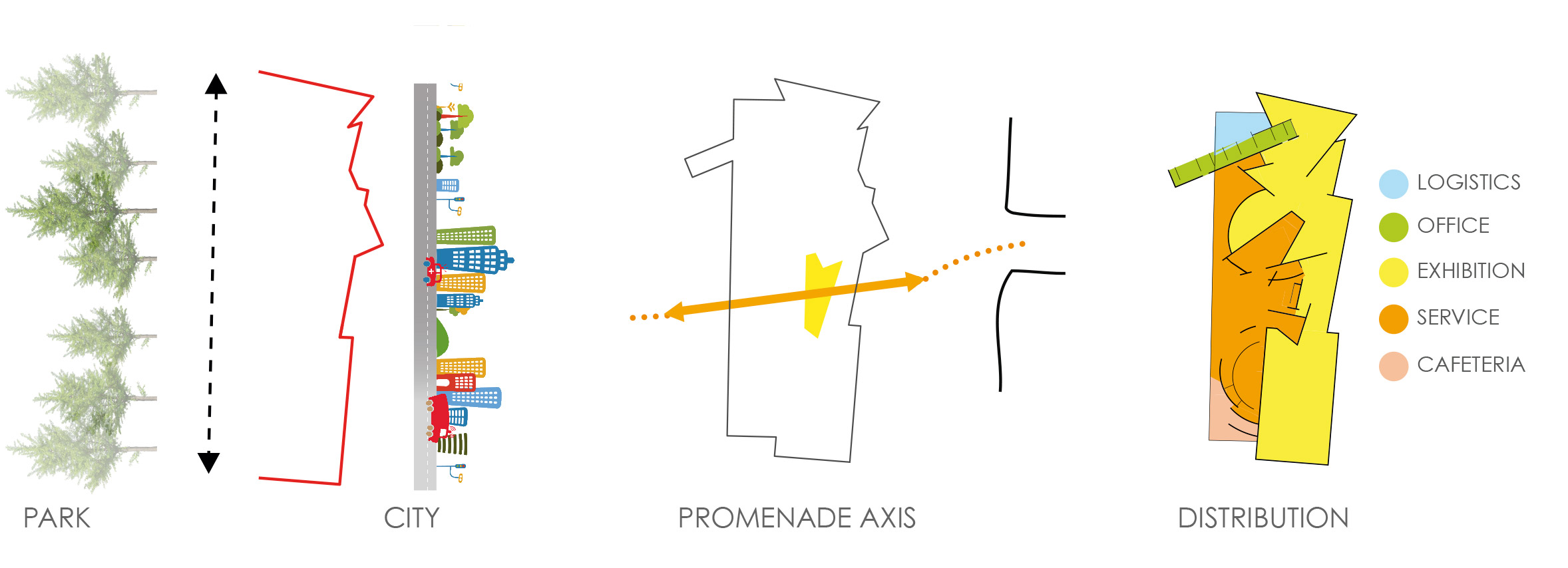
The organization it is done in order to let Service Area be open in the case the Exhibition remains closed to the public. It has a clear organization in different packages responding to the competition brief requirements.
Services area it is in direct contact with the park, as an extension of it. We propose a Museum open to the public, to invite people not only to access but to take part into the activities going on inside.
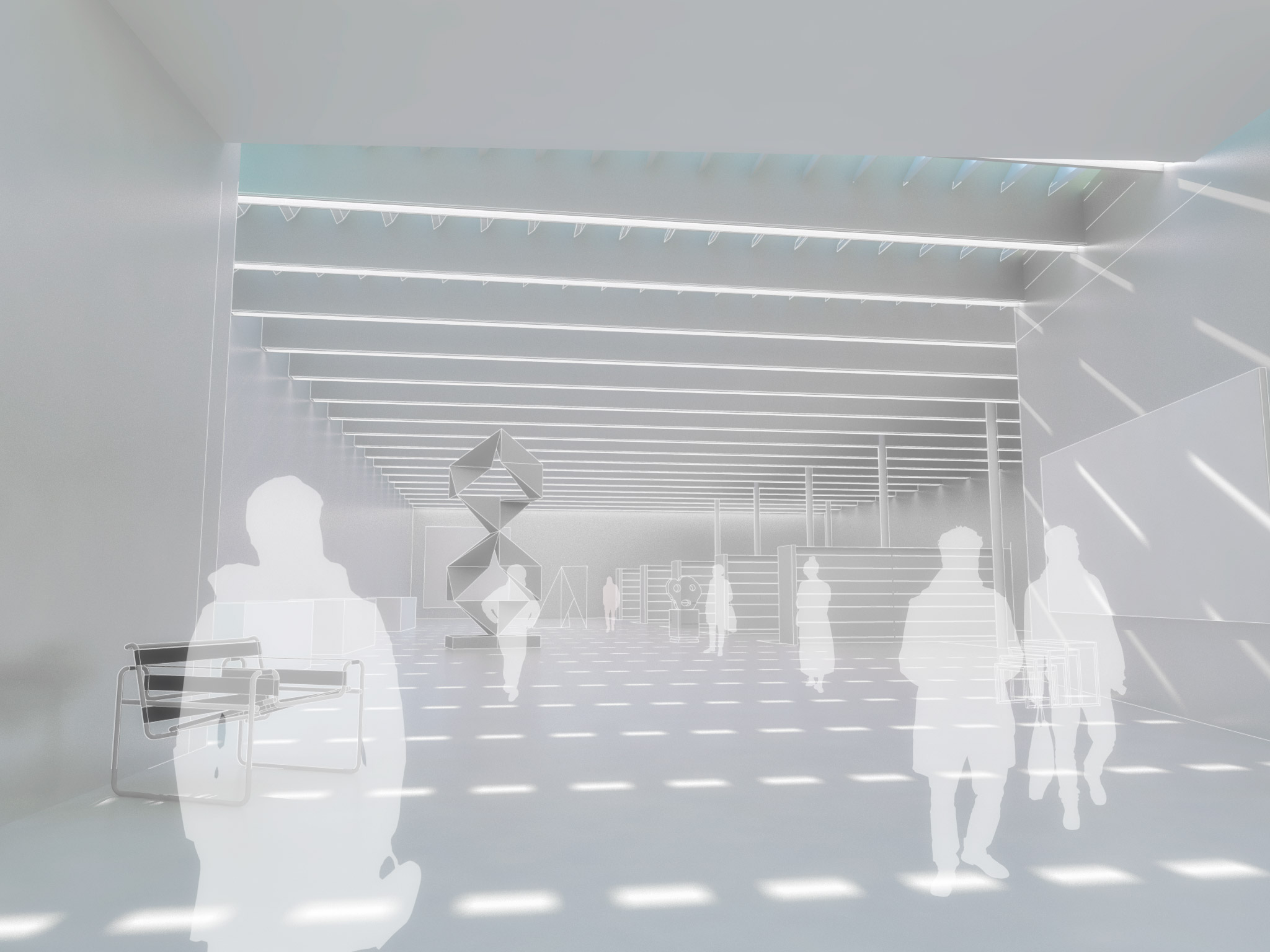
The Exposition it is protected from direct illumination. It works as a high security area that can be closed while the rest of the centre it is open if necessary. The expositions have upper indirect illumination. At some points we open windows create small resting areas in contact with the exterior landscape.
The exposition organization it is very clear. The access it`by the Topos “Prolog”. On the right side it is the temporary Exhibition room. On the left side the permanent Topos. Those are organized by a linear tour passing by each Topo Room in the ground level, with a continuation in the first floor that drives you to the beginning of the exposition in the first level.
[:es]Interior space it is architectural proposal central theme. Bauhaus was also a consequence of Adolf Loos research about planning architectural space from inside to outside. This project has been created as an internal landscape contained into a glass box, a Bauhaus city under a great roof. This roof it is a huge building lamp. Great 20 meters long and 2 meters high beams cover the building liberating interior space from structural elements.
The organization it is done in order to let Service Area be open in the case the Exhibition remains closed to the public. It has a clear organization in different packages responding to the competition brief requirements.
Services area it is in direct contact with the park, as an extension of it. We propose a Museum open to the public, to invite people not only to access but to take part into the activities going on inside.
The Exposition it is protected from direct illumination. It works as a high security area that can be closed while the rest of the centre it is open if necessary. The expositions have upper indirect illumination. At some points we open windows create small resting areas in contact with the exterior landscape.
The exposition organization it is very clear. The access it`by the Topos “Prolog”. On the right side it is the temporary Exhibition room. On the left side the permanent Topos. Those are organized by a linear tour passing by each Topo Room in the ground level, with a continuation in the first floor that drives you to the beginning of the exposition in the first level.[:]
[:en]
Client: Dessau City Council
Type: Museum
Location: Dessau, Germany
Year: 2015
Budget:/
Size:4.100 m²
Program: Museum, Cafeteria, Workshop, Offices
Status: Competition
[:es]Client: Dessau City Council
Type: Museum
Location: Dessau, Germany
Year: 2015
Budget:/
Size:4.100 m²
Program: Museum, Cafeteria, Workshop, Offices
Status: Competition[:]
[:en]
Architects in Charge: Ignacio Gias
Collaborations: Borja Fernández Dominguez, Martin Tubiana, Claire Tournier, Felicia V Ocke
[:es]Architects in Charge: Ignacio Gias
Collaborations: Borja Fernández Dominguez, Martin Tubiana, Claire Tournier, Felicia V Ocke[:]
